Red Hybrid
Blending PAYM and PAYG so agents can guide customers through selecting bundles and smartphones, otherwise known as ‘Red Hybrid’.
I led the effort for a nationwide renovation.
ROLE
UX Designer
DURATION
9 sprints - joined in Sprint 3
TEAM
UX, Engineering


Curated for customers. Faced by Agents.
Over £1M
INCREASE IN AVERAGE ORDER VALUE
18.2%
CONVERSION
The Problem: Mismatch between UI elements and backend systems
Technical pointed out an issue - during code review there was a fractured relationship between the interface of the bundle and refund screens, and the backend systems. This created uncertainty about how much data the interface could reliably display.
There are various points across the service that the changes would be applicable to, so I had to pinpoint them.
This is what design had inherited:


There was no way for Agents to view customers’ failed payment records.
Whenever a customer wants a refund for a payment, the Agent has to undergo an entire data pull of all historic records to trace the refundable payment, rather than the specific records needed.
If a customer's payment fails, Vodafone gives you 3 days of concession - without paying the money. The customer will still get SMS messages & emails saying please update your card.
Areas traced, but the road ahead was far from straightforward.
The main ask was to view the information related to bundles so the Agent can inform the customer about details related to the bundle.
Speaking to functional teams it became apparent that while the framework was theoretically sound, implementing our vision would demand more effort than anticipated.

On a business level this translated to three areas of focus to address how we can redefine the architecture of the service.
Drawing on the discovery sessions I listed a plan of action for the Hybrid bundles:
AS AN AGENT
Know the bundle payment record is success or failed?
Balance the visual appeal and usability of the promotion section, ensuring icons are clear and informative
AS A CUSTOMER
Intuitively navigate through the mobile plans with reduced stress?
Learn engaging yet descriptive promotion information about 5G, Unlimited Data, and Price with maximum readability?
AS A BUSINESS
Cut Average Handling Time while improving customer satisfaction?
Create a flexible promotion display that highlights key details without compromising on design simplicity or loading speed?

Finding structure and changing my focus.
Insight from earlier questions helped me specify down on outcomes we set out to achieve:
REDUCE INFORMATION OVERLOAD
Present clear and informative bundles to customers to reduce the stress of deciding and comparing deals
REFUND EFFICIENCY
Amalgamate the 4-step refund process into a single user interaction, rather than automatically pull in all the records
REVERSE AGENT BURNOUT
Enhance the ability of the backend logic to synthesise data when needs be
INCREASED TRANSPARENCY
More explicit view of payment records for SIM & mobile bundles
But we hit a hurdle.
Functional team were persistent on having a column for promotion name and a column for description. Our counter argument was that we need to try and compromise with having a 'generic' description - raising the case that performance time would not be effected.
We needed to meet our existing templates, consistent layouts, and inclusive design - with icons and text that drives better scalability and association.
3px
3px
96px
Redisign, kinda. Site evolution, absolutely.
Notable changes were the promotion name on the left, and the description on the far right.
This meant we had to we'd be compromising with what we advocated for - considering the commonalities in the bundle options...


We had to revisit the Acceptance Criteria.
As a UX team, we couldn’t approve until we could apply our minimum requirements.
Reestablished with the Product Designer and Business Analyst how we can account for existing templates, consistent layouts, and inclusive design.

Back to the drawing board.
In the design itself, I opted for a more minimalist approach, focussing on the core user experience. This meant stripping away the bundle information to the essentials like price, data, and network classification (4G/5G).
Attention to clear presentation, while allowing for future scalability, even if it couldn't be fully realised in this sprint.
Option 1
Static text to allow for the most minimal display for Agents


Option 2
Minimising visual overload and maximising the rest of the space for the classification list.


Option 3
Hybrid product description to follow the same pattern of design, with care towards legibility in pricing display.


Ironing out the consistency.
We were very limited in real estate, so we knew dealing with applets and modals required more intricacy. The smaller the width, the greater the attention to spacing.

After addressing AHT concerns about loading time, we simplified it down further.


Getting the quick fixes in.
Customers may have a monthly bundle payment that falls through on the instalment day, so we’d assumed all the payments were successful payments.
Technical improved the sequence of information fed into the required databases - refunds now involved a 4-step process to view failed payment records:


But wait - what’s the worst that can happen?
We don’t want Agents to hit a brick wall.
We were careful not to assume that the Agents would undergo a linear approach each time they refund customers so I addressed a couple of edge cases using error paths:
Eligibility period for a refund passes
There’s technical issues with the refund
Refund has already been processed
Payment processor systems are down


Then Marketing team dropped a bomb on us - “Agent, do you copy?”
Just before we finalised our designs, we’d received an update about copyright concerns in relation to ‘Hybrid’ - the term was already patented. Oh oh...
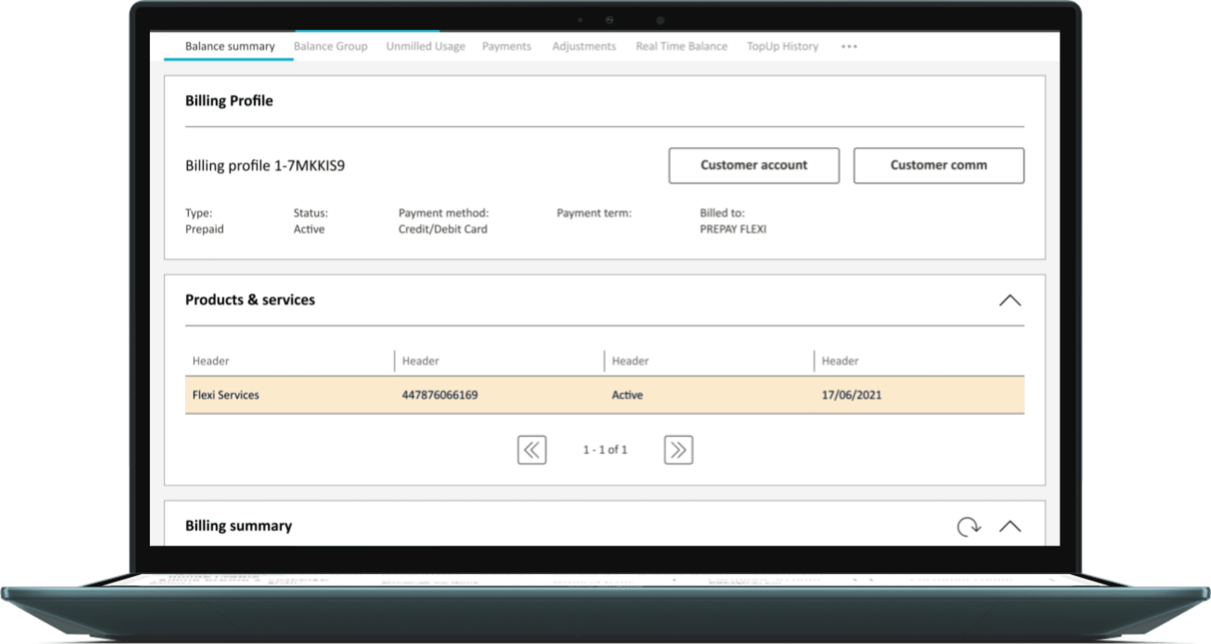
We introduced a new term to label our entire bundle plan mission, Flexi, which got the nod from Marketing.
Content review involved tracing the old naming convention and changing it accordingly.

A seamless experience.
For the bundle selection and refunds, the updated process from start to end should take an Agent no longer than a minute.
Over £1M
INCREASE IN AVERAGE ORDER VALUE
18.2%
CONVERSION
Bittersweet ending
Whilst UCD pushed for Figure 1, Functional’s update last week clarified that while the framework exists, substantial effort is needed to integrate data and execute our proposed design.
Figure 1
Reversion to original, with less iconography
Figure 2
Minimalistic, string of dynamic text
Whilst UCD pushed for Figure 1, Functional’s update last week clarified that while the framework exists, substantial effort is needed to integrate data and execute our proposed design.